Arcade Game Typography: The Art of Pixel Type
£15.50£19.00 (-18%)
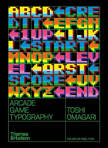
Featuring pixel typefaces carefully selected from the first decades of arcade video games, Arcade Game Typography presents a previously undocumented ‘outsider typography’ movement, accompanied by insightful commentary from author Toshi Omagari, a Monotype typeface designer himself, and screenshots of the type in use. Exhaustively researched, this book gathers an eclectic typography from hit games such as Super Sprint, Pac-Man, After Burner, Marble Madness, Shinobi, as well as countless lesserknown gems. The book presents its typefaces on a dynamic and decorative grid, taking reference from high-end type specimens while adding a suitably playful twist. Unlike print typefaces, pixel type often has bold colour ‘baked in’ to the characters, so Arcade Game Typography looks unlike any other typography book, fizzing with life and colour.
Read more
Additional information
| Publisher | Thames and Hudson Ltd, 1st edition (10 Oct. 2019) |
|---|---|
| Language | English |
| Paperback | 272 pages |
| ISBN-10 | 0500021740 |
| ISBN-13 | 978-0500021743 |
| Dimensions | 17.27 x 2.54 x 23.37 cm |


by Jonathan
Great book, loads of 8×8 fonts, loads of games screenshots, loads of colour. No mention of any 8-bit computers of the era though, this is arcade only.
by Jonathan
Inspired me to create my own bitmap typeface 🙂
by Merman
I’m a real fan of books telling the history behind gaming, and this one really stands out to me. It may be a very niche subject – the typography of the arcade game, and more specifically fonts created using an 8×8 pixel grid – but there is so much fascinating detail. Screenshots from the games and beautifully laid out font samples are only part of the book. There are intriguing facts, details about the games/series and even a revelation about the earliest arcade font (what we now call the Atari or Namco/Pac-Man font) that became so prevalent in Japanese games. So if you appreciates games and fonts, this is the book for you!
by Denis Karpov
Such a nice and informative book about 8 bit fonts.
by Robin
I’m well known among friends, family and colleagues as a bit of a typography nerd… but I’m also a huge fan of retro gaming, and spent an inordinate amount of time (and pocket money!) in seafront arcades in my youth, so this book – rolling all three interests into one – seemed right up my street, and was given to me as a birthday present this year.
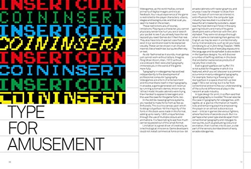
Presentation is clean and clear, generally with three typefaces per page, but with a handful of highlights given a more lavish treatment, spread across two pages, along with the occasional feature spread, showing just a single character from the preceding and following pages.
Aside from a few brief articles on specific themes, commentary is kept to a minimum, with a paragraph or so of choice notes on each typeface. The author pulls no punches with these, calling out poor choices and errors wherever they arise, as well as celebrating the unlikely – and possibly unintended – successes. The most interest aspects of the book, to me, are how certain fonts have been used, reused, amended, appended and developed over decades of arcade history, and how bitmap artists strove to replicate many well-known print typefaces within the confines of an 8×8 pixel character grid. It’s genuinely surprising what can be achieved with a mere 64 pixels, in the right hands.
If there’s ever a follow-up – whether it be covering home systems or larger format arcade fonts – I’m definitely on board!
by Cagdas U.
Who would have thought that the subject of this book, extracted from an incredibly thin seam of the typographic coalface, could prove so interesting. Toshi Omagari writes with enthusiasm and technical knowledge (he works for Monotype) about historic arcade game type. None of the typefaces in the book existed outside of a digital screen so there are none of the usual type attributes like point sizes, leading, alternate characters, small caps et cetera. With these faces it’s all down to an eight pixel square box but within this very tight limitation some very creative ideas have flourished.
The ten chapters on typefaces have plenty of complete alphabets plus numbers to show how clever some of the letters are though the three Sans chapters (Regular, Bold and Light) with letters like E,F,H,I, L and T with no curves obviously stand out from other letters that have curves, this was solved by adding graduated colour pixels, partial or full drop shadows and thick or thin outlines to the letters and in the case if a capital I adding a block serif top and bottom to make fill out a square like other letters. The basis for so many of these alphabets was an Atari font, probably created by Lyle Rains sometime in the late Seventies.
Lower case letters in most of the fonts are a real challenge and really so many of these letters end up as being almost unreadable. The chapter on Slanted (or italic) faces reveals some clever ideas for those characters that are basically straight, now they have to have a pixel added here and there to suggest a leaning letter. Page 184 has an alphabet for the 1987 Shinobi game with not only italics but in a sort of script. Luckily the eye reads complete words rather than individual characters.
The book is basically visual with its dozens of coloured alphabets, some of which are enlarged to fill a spread so it’s possible to study how the characters have been made up in the eight pixel grid and I doubt they have ever been seen as big as this. A nice touch, here and there, are screen grabs of some games showing how the various type faces work as real words. Omagari’s book covers an incredibly tiny corner of the typographic world but its excellent design and interesting words make the subject a worthwhile read (especially for typographers).
by AY
Fantastic book full of exciting info, but marred by the odd design decision to present most of the colourful specimens on a light grey background – as well as being visually uncomfortable it robs the fonts of their charm and impact.
by Mr James Lloyd
The tone of this wonderfully nerdy book is perfectly balanced. On one hand, there is some seriously detailed study by a true typographic expert. On the other, there is the garish wonder of the games and designs on show. The author clearly enjoys the cheap thrill of the arcade heyday and allows this passion to filter through his prose even when discussing a misplaced pixel or half-hearted bit of anti-aliasing. It’s a fun read, dense with enlightening details.
Large parts of the book have you playing spot the difference between reproductions of the entire glyph set encoded onto games from different manufacturers that have strikingly similar fonts. So when we discover that Space Harrier has a cap V misaligned (by one whole pixel!) it feels like a momentus event It had me reaching for MAME to see it in RGB. I’m now about a quarter of the way through and anticipating many more such moments of minor astonishment.
In case it matters to you, the focus is tightly on arcade games, not home ports or dedicated console games. It defines it ground clearly though, and will make you appreciate the limitations of an 8×8 pixel grid, and the fun that designers had in trying to bend it to their needs.