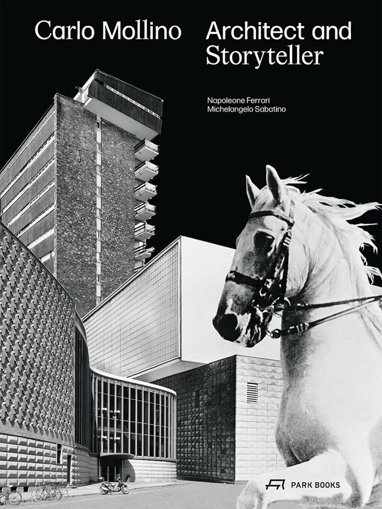


Carlo Mollino: Architect and Storyteller
£58.50£85.50 (-32%)
- First-ever monograph on Carlo Mollino as an architect
- Demonstrates Mollino’s prowess in architectural design
- Based on extensive new research and drawing on rich archival material
- Lavishly illustrated with previously unpublished images, plans, drawings, and documents
Today, Italian architect and designer Carlo Mollino (1905-73) is known chiefly for his furniture designs. He is famous also for his erotic polaroid photography of the 1960s, which has been subject of many exhibitions and has lost nothing of its great appeal to the fashion world today. Much less attention has so far been given to Mollino’s architecture, and a comprehensive critical study of his work in this field has been lacking. Yet his built work, although relatively small, constitutes a seminal contribution to modernism that is uniquely marked by a strong relationship with Surrealism.
Based on years of research and drawing on rich archival material as well as on Mollino’s own writings, this new book is the overdue tribute to an extraordinary personality in 20th-century architecture. It features an exemplary selection of his key designs, both built and unrealised, lavishly illustrated with images and reproductions of previously unpublished plans, drawings, and documents. Rounded out with scholarly essays by expert authors, this is a long-awaited addition to the library of architecture lovers, professionals, and scholars.
Read more
Additional information
| Publisher | Park Books, Illustrated edition (7 Jan. 2022) |
|---|---|
| Language | English |
| Hardcover | 320 pages |
| ISBN-10 | 3038601330 |
| ISBN-13 | 978-3038601333 |
| Dimensions | 29.21 x 4.57 x 31.12 cm |


by Amazon Customer
I bought this book with an interest in the interior style of Mollino as well as his architecture. His home, worked on for 8 years, Casa Mollino, and now a museum, is known for its eclectic stylised interiors. There is one photo of this seminal project and I am sorely disappointed that the home that Mollino poured himself into is barely mentioned. Highly lacking.
by Ustad47
After several delays after pre-ordering it finally arrives. The Hardback boards are only 2mm and flimsy. Nice endpapers. The above item spec. needs updating as there are now more pages and a different format size. The big disappointment is the slack typography and design inconsistencies. The folio numbers come and go randomly on the full-page images, some on left, some on right, some on both! Also, the typography is awkward and crammed. Why use US em-dashes? Worse still, the over-large text columns are left-aligned but hyphenated. This is not necessary for this alignment style. The word-breaks are very eccentric for English and do not aid legibility. Names should not be hyphenated (p.431: Isiah ‘Ber-lin’). If only the ‘Electrosmog’ studio had let the smog clear and paid some much needed attention to the automatic line-feed and turned the line-endings. An English-native sub-editor is required. Hopefully these issues will be resolved for the second edition, because what we have here is ostensibly an uncorrected proof.