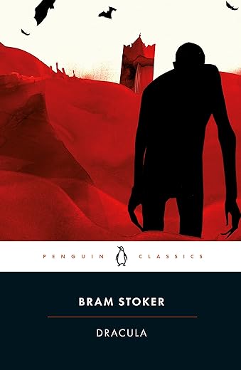
Dracula: Stoker Bram (Penguin Classics)
£6.90£7.60 (-9%)
‘The very best story of diablerie which I have read for many years’ Arthur Conan Doyle
A masterpiece of the horror genre, Dracula also probes identity, sanity and the dark corners of Victorian sexuality and desire. It begins when Jonathan Harker visits Transylvania to help Count Dracula purchase a London house, and makes horrifying discoveries in his client’s castle. Soon afterwards, disturbing incidents unfold in England – an unmanned ship is wrecked; strange puncture marks appear on a young woman’s neck; a lunatic asylum inmate raves about the imminent arrival of his ‘Master’ – and a determined group of adversaries prepare to battle the Count.
Edited with an Introduction and notes by MAURICE HINDLE
With a Preface by CHRISTOPHER FRAYLING
Read more
Additional information
| Publisher | Penguin Classics, Revised ed. edition (27 Mar. 2003) |
|---|---|
| Language | English |
| Paperback | 512 pages |
| ISBN-10 | 014143984X |
| ISBN-13 | 978-0141439846 |
| Dimensions | 2.54 x 12.7 x 19.56 cm |

by david canford
I have seen many adaptations but never read the novel. It must have been quite sensational when released in 1897. Now, while it remains a good read, it is very much of its time.
At times the story is gripping, at others a bit dull and over long. The beginning is excellent and the middle has its moments. The ending I found anti climactic.
The attempt at regional accents in some of the dialogue is distracting as is Van Helsing’s habit of missing ’s’ off verbs. I’ve always found the Dutch to be superb speakers of English so wonder who the author drew upon for inspiration.
by 52ofa1000
Arrived quickly and in mint condition, daughter studied for a level found dry and boring. My wife and I devoured book.
by ND
I recently had the pleasure of diving into Bram Stoker’s “Dracula,” and it’s safe to say that I was utterly captivated from start to finish. This timeless classic is an absolute masterpiece that has stood the test of time for good reason.
Stoker’s storytelling is nothing short of brilliant. His ability to build tension and create an atmosphere of dread is unparalleled. The way he weaves together various narratives through journal entries, letters, and diary pages adds a unique and immersive dimension to the story, making it feel all the more real.
But the true star of the show is Count Dracula himself. He is the epitome of the suave and enigmatic vampire, a character who both repels and fascinates. Stoker’s depiction of the Count as a seductive yet sinister figure is a stroke of genius.
The characters are richly developed, each with their own quirks and motivations, and the settings, particularly the eerie Castle Dracula, are vividly described. The novel’s themes of fear, desire, and the battle between good and evil are explored in a way that continues to resonate with readers today.
“Dracula” is a must-read for anyone with a love for gothic literature, horror, or simply a well-crafted story. Even after all these years, it remains a gripping and chilling tale that will haunt your thoughts long after you’ve closed the book. It’s a true masterpiece, and I can’t recommend it enough!
by Michelle
A lovely edition from Barnes and Noble flexibound collection
The story is the one everyone is familiar with.. Dracula. The flexibound editions are flexible but do look leatherbound. The print is perfect both on the outside and in. The cover is amazing to look at, a vibrant red, very eye catching and just what Count Dracula would command it to be. This book is a welcome edition that sits perfectly along side the larger leatherbound Barnes and noble collection.
by Linda
This book has appeal. I bought it 3 months ago and still have a sneaky look at it most day’s. But, I both love it & I am a bit disappointed by it at the same time!
I first read Stoker’s classic when I was 16 and thought it was amazing. For years after I wondered how fantastic it would be if it was republished and bound like the 1st Edition of 1897. That was a couple of decades ago, so imagine how pleased I was when I found this Amazon page.
Unfortunately, as it took a while to dispatch, I was so impatient, that, ‘caught up in the Dracula moment,’ I turned to Google Images to see the original 1st editions. It was then that I noticed some difference’s in comparison with the customers uploaded images, which disappointed me a bit and yet further difference’s when I received it. I wasn’t expecting absolute 100% perfection, but, as ‘facsimile’ means an exact copy, especially in printed material, I kind of expected something pretty close, even more so because the original publisher had undertaken the project. Here are some of the more obvious deviations:
1) 2012 Edition; The front & back cover are authentic enough but, the spine omits the horizontal red lines from the head & foot & looks incomplete without them.
2) 1897 Edition; The spine says ‘Constable Westminster’ in a larger, Old English, font toward the bottom. The 2012 edition has a smaller, uppercase serif for, just, the publishers name only. The Old English font typically mirrors the Gothic Revival style of the time. So, I wish they had stuck with the Old English one for ‘Constable’ instead.
3) 2012 Edition; On the spine there should be a line space between Bram & Stoker and the author & title lettering should be a bit lower down.
4) 1897 Edition: The main title page was quite different. Although a very similar typeface has been used, the 1st edition had a good few spaces below the title, before ‘BY’, & the word ‘BY’ is in a much smaller point size. A couple more line spaces, again, before the author’s name, about half the size of the title. Also, the title had wide kerning: D R A C U L A. This should have been a page to get spot-on but, sadly, the 2012 edition doesn’t really follow the original page layout that closely.
5) 2012 Edition: Page 1, Chapter 1, the heading is smaller then it should be and the sub headings larger. Although, the main page text looks typeset exactly right with the wording on each line starting and ending, before returning to the next line as the original.
6) 2012 Edition: Is about 1cm thicker in depth then the 1st editions, which were described, on Abe Books.com, as just over an inch in paper bulk. Which would explain why the title and author lettering doesn’t touch the edges of the spine as the on the 1st edition’s. So a thicker paper must have been used.
7) 1897 Edition: All 3 sides of the page edges were not guillotined smooth. On the 2012 edition only the front edge is decked. As this book comes in a slip case it might have looked better if they had made all 3 sides uneven too.
As the design is so straightforward, I find it difficult to see how gaffe’s were made on this edition, which makes the use of the word ‘facsimile’ questionable. I assume they are deliberate, to set the two apart. I would have expected Constable to have made a point of saying they have painstakingly studied and researched the original, but, if they did, they have also made changes. Clearly this is more a loosely based modified imitation, than having more impeccable attention to detail.
In Amazon’s “Look Inside!” feature the colophon page says ‘Printed & bound in the UK’ but, my book says China, lol, you wouldn’t have seen that back in Stoker’s day, a sign of the times I guess! And if I’m honest, I could live without the introduction from Colm Toibin. Stoker’s reproduced contract is great to see, but, putting a thin white border around it makes it look like a good quality colour photocopy. I can’t understand why it wasn’t bled to the edge.
There is a facsimile paperback version, released by the same publisher, as well, with same style yellow/red artwork. The first ever paperback edition was also by Archibald Constable & Co Ltd in 1901. It had new artwork which included navy blue typography and dividing lines around a sketch of Dracula scaling down the castle wall, as Harker looks on from a window above. It was the first ever illustration of the vampire which was officially approved by Stoker himself. The paperback contained a new introduction by the author who also self-abridged the story. It would have been fantastic if Constable had used the initiative to bring this 1901 softcover back to life, instead, as an authentic facsimile and an alternative to the Limited Edition hardback. I’m sure I wouldn’t have been the only one to have bought it as well as the hardcover replica. An opportunity missed?
Furthermore, the thumbnail image used by Amazon, via the Constable & Robins website, is an inexact example of how the 2012 & 1897 front covers should look, by apparently using a picture of a morocco-leather rebinding of the 1st edition (replacing the original yellow cloth). Although in keeping with the style, the title and author are shown lower & reduced within the red lined border, rather than over-lapping it, as illustrated correctly here in Amazonian’s pics, and the 1897 1st editions on Google Images. How this happened is anyone’s guess.
However, all things considered, this is still a lovely cloth-bound, deckle edged, book in a sturdy slipcase and a joy to behold, and you’re not going to get anything closer. OK, I know this couldn’t have been exact as it has the Toibin introduction, but, I think there are too many changes to be passed over, &, for me, it kind of defeats the object. It would have been much better if the spine was given the detailed finishing touches it lacks, in particular the integral horizontal lines & Old English font for the publishers name, also, an authentic title page layout should have been a must. There is already a Limited Edition 1 of 1000 numbered title page in addition to the actual title page. This should be more than enough to distinguish it from the original, never mind altering the main title page as well. What happened to standards? Most people wouldn’t know any different and neither would I if I hadn’t looked on Google. I’m not a book specialist, I have no idea if most ‘facsimile’ book’s are more precise or not. But, if there were fewer inconsistencies it could’ve been the dogs doodahs with still enough distinction between this and the original.
by lee joel
This book is so lovely I bought it for someone for Christmas.
by lee joel
The media could not be loaded.
Absolutely stunning looking book, I brought this for my wife as a present and she adores it, she loves how it looks, it is definitely worth buying because it’s one of those book everyone should read at least once and have in their collection.
by David
love “golden” pages