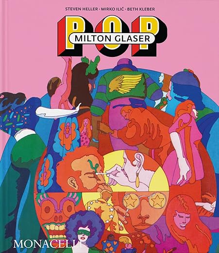


Milton Glaser: POP
£34.00£42.70 (-20%)
‘Milton Glaser’s designs changed the way we see the world.’ – Gloria Steinem
An overview of the work of illustrator and designer Milton Glaser during the 1960s and 70s
From 1954, when he co-founded the legendary Push Pin Studios, to the late ’70s, Milton Glaser was one of the most celebrated graphic designers of his day, whose work graced countless book and album covers, posters, magazine covers, and advertisements, both famous and little-known. Glaser largely defined the international visual style for illustration, advertising, and typeface design and interest in his legacy continues unabated, with modern creatives acknowledging his influence; for example, in 2014 Mad Men creator Matthew Weiner enlisted Glaser to design the ad campaign and branding for the show’s final season.
His renowned work garnered solo exhibitions at the Centre Georges Pompidou in Paris and the Museum of Modern Art in New York. Creator of the iconic ‘I love NY’ logo (featuring a heart symbol in place of the word ‘love’) and cofounder of New York magazine, Glaser received numerous accolades and lifetime achievement awards. Across thousands of works across all print media, he invented a graphic language of bright, flat color, drawing and collage, imbued with wit. This collection of work from Glaser’s Pop period features hundreds of examples of his design that have not been seen since their original publication, demonstrating the graphic revolution that transformed design and popular culture.
Read more
Additional information
| Publisher | The Monacelli Press, 1st edition (30 Mar. 2023) |
|---|---|
| Language | English |
| Hardcover | 288 pages |
| ISBN-10 | 158093613X |
| ISBN-13 | 978-1580936132 |
| Dimensions | 25.15 x 3.05 x 30.23 cm |


by Dez
The production team’s idea of color management was to handle the yellowing of the paper as a color in itself. As a result, every other image looks like it has been soaked in dog pee. Glowing yellow all around, and some white floating at the center. It is hideous. It is mind-numbingly amateurish. It not only spoils the original designs, making you wonder how Glaser intended them to look, but it creates wild inconsistency across the featured serialized works (book and record cover series). It all looks like random image grabs from eBay. Shockingly substandard from a subsidiary of Phaidon.