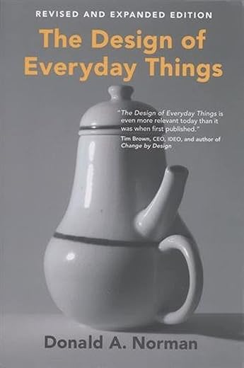
The Design of Everyday Things, revised and expanded edition (The MIT Press)
£17.10
Even the smartest among us can feel inept as we try to figure out the shower control in a hotel or attempt to navigate an unfamiliar television set or stove. When The Design of Everyday Things was published in 1988, cognitive scientist Don Norman provocatively proposed that the fault lies not in ourselves, but in design that ignores the needs and psychology of people. Fully revised to keep the timeless principles of psychology up to date with ever-changing new technologies, The Design of Everyday Things is a powerful appeal for good design, and a reminder of how — and why — some products satisfy while others only disappoint.
Read more
Additional information
| Publisher | MIT Press, 2nd revised and expanded ed edition (20 Dec. 2013) |
|---|---|
| Language | English |
| Paperback | 368 pages |
| ISBN-10 | 0262525674 |
| ISBN-13 | 978-0262525671 |
| Dimensions | 15.3 x 2.83 x 21.8 cm |


by AMG
The book is very good but the paper is so thin it shows text through from the page overleaf making it all look fuzzy & slightly out if focus. The paper is also too porous. I do not have sweaty hnds but holding the Right hand page as I read (my style) left indents in the paper. Very poor quality for an expensive paperback.
by Kiteman
I bought this because I’m moving my teaching towards a design focus (I’m sick of seeing my workshop filled with dozens of identical projects!), and this book is fascinating. It’s definitely going to take two reads to get the full message from it.
But, generally, if you find yourself getting frustrated by the made world around you – doors you can’t find, taps that turn the wrong way – this is the book for you.
by Douglas F.
This book is a classic in its field but … The picture quality throughout his printing is terrible, the photos are small, low resolution and in black and white so you really have to peer at them to understand what is being shown / discussed. Not great for a book about design. Whilst this updated version has lots of new content it uses fairly technical language and isn’t a book that you just flow through it feels more like an effort to read it. It’s a good book but one you must want to read
by W. Reilly
This is my first time reading this book. And I have to say I am really enjoying it. It is obviously based on the authors most loved interest. Norman shows that he is an ordinary person who gets frustrated with (bad) design in the same way we all do. But then he sets about trying to help us create guidelines for better or even great design. This book is not about clean lines and hidden details. It’s about obvious usability and making life easier.
The book is technically old in the sense that he refers to old tech/computers/phone systems that were common for the time of writing. Which as we know Tech moves on kind of fast. But you have to stop yourself from saying “this is so out of date”. Because really the principles are timeless. Good design will always be based on how well the design fits its purpose.
So if you have an interest in design and particularly the design of things you rely on everyday. Or if you will be responsible for the design of everyday things. This is the book to get your ideas and thinking focused on the user.
by Elliotfinch
This is a really good, and inciteful book about the psychology of how we interact with things in our day to day.
If you’re designing anything that will be used by a human (like most things), I think this book is a must read.
It has subtly changed the way I think when designing something.
I’m not really one for reading. But I have read this twice, and got the audio book.
by Haeg
It’s an exceptional book, so why have I given it only 4 stars?
Certainly not the books fault, but this book does tend to get recommended to students as the definitive book for software interface design.
The book is quite dated, being just a renamed reprint of 1989 book “The Psychology of Everyday Things”, identical content, except with a new foreword.
The insight into the flawed design of everyday objects is amazing, but could have been so much better if instead of just updating the foreword new chapters were added dealing with modern issues (computers, satellite tv, mobile phones, etc).
Reading this book will still make high tech designers better, but don’t expect it to be as relevant to you as it was to your lecturer who read it 17 years ago.
by Maarten de Vries
This book is obviously about design and everyday things, like doors, taps and electr(on)ic equipment, but it’s also about psychology and not so everyday things, like museums, aircraft and nuclear power plants etc. If you’re only mildly interested in these topics, then this book might be a bit “heavy” for you, but if you’re really interested in them, it’s a classic, that is on the mandatory reading list of many design schools. Personally, I originally wanted to be a car designer, so I really enjoyed it! In fact, from now on, I think I will remember this book, every time I encounter things that are designed very well, or very badly!
Basically, the book is an almost emotional plea for design, based on usability, as opposed to aesthetics (the statement “it probably won a design prize” is not a compliment in this book!) and cost (of materials, manufacturing etc). These factors are also important, but they matter more to the manufacturers and the (often corporate) customers of the product, than the ultimate user, and what’s the *use* of a product that the user doesn’t know how to use?
Designing for usability is probably more complex than you think, even for something as small and seemingly simple as a ballpoint pen. We could overcome this complexity if we could learn from our mistakes, but the multiple forces of a competitive market often prevent this process of evolutionary design. As a result, the same mistakes get made over and over again, and new ones are constantly added too, often on the back of new technologies, which are actually supposed to make our lives easier! Norman calls this “the paradox of technology”.
To overcome this, Norman proposes “seven principles for transforming difficult tasks into simple ones”:
1. “Use both knowledge in the world and knowledge in the head.” The design of the object should help the user to form a good “conceptual model” or “mental map” of how it works, preferably without instruction labels (if it needs them, it’s probably not designed very well) or the user manual, because most users don’t read them anyway. A great example of an often misunderstood object is the thermostat. Many people don’t understand that this is a simple on/off switch with a single speed. If they want to heat up a room asap, they turn the thermostat to the maximum temperature, but this doesn’t make it go any faster. On the contrary, you risk overheating the room and having to cool it down again!
2. “Simplify the structure of tasks.” Don’t rely on the user to remember too many things at once, because our memory is limited.
3. “Make things visible: bridge the gulfs of Execution and Evaluation.” Make it obvious which actions the user can/should take, and provide feedback when he/she has taken that action.
4. “Get the mappings right.” The left switch is for the left light, the right switch is for the right one.
5. “Exploit the power of constraints, both natural and artificial.” If you don’t want people to insert the battery the wrong way, then make sure it doesn’t fit that way. This is a physical constraint, but there are also semantic, cultural and logical ones.
6. “Design for error.” Errors are not bad, they are normal! Design things in such a way that trivial errors are easily reversed (“undo”) and serious errors are avoided in the first place.
7. “When all else fails, standardize.” Think of the round clock-face, the QWERTY keyboard, turn a screw clockwise to tighten it etc.
The other thing I found really interesting was the relationship between usability and aesthetics. On one hand, something that looks very complicated probably isn’t very easy to use, but on the other hand, “easy looking is not necessarily easy to use (…) We found that to make something easy to use, match the number of controls to the number of functions and organize the panels according to function. To make something look like it is easy, minimize the number of controls. How can these conflicting requirements be met simultaneously? Hide the controls not being used at the moment. By using a panel on which only the relevant controls are visible, you minimize the appearance of complexity. By having a separate control for each function, you minimize the complexity of use. It is possible to eat your cake and have it, too.” This is one of the things Bang & Olufsen does very well, for example, and Normal actually uses an example of B&O in the book.
In summary, I can understand why this is a “must read” for designers, even though it was originally published back in 1988, because the seven principles are basically timeless. My only “buts” are:
1. I think the book could have been structured more clearly, which is of course ironic, considering it’s a book about design and it actually includes a discussion about the structuring of writing material! I sometimes got a little bit “lost” in the text and I would have preferred to see the seven principles in the table of contents. A bit dull maybe, but very usable ;o)
2. I would love to see Norman apply his principles to some of the new technologies that have appeared and gone mainsteam between then and now. I’ve just found his follow-up book, called
The Design of Future Things
, but I’m not sure that’s quite what I had in mind ;o)
Your comments are welcome!
by Amazon Customer
A must read for any design student