

Roll over image to zoom in
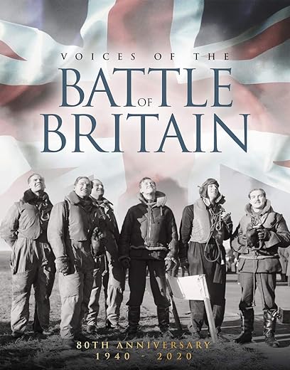
Voices of The Battle of Britain 80th Anniversary 1940 – 2020
£8.80£19.00 (-54%)
It was a crucial moment of WW2. 1940. The Royal Air Force, virtually alone, defended the skies of Britain against massed formations of German bombers. They put up such a ferocious defence that Hitler gave up ideas of invading Britain and turned his attention to an assault on the Soviet Union. Of those pilots who courageously flew their Spitfires and Hurricanes against the Luftwaffe barely a handful remain. However the authors have interviewed no less than eighteen survivors and it is their memories and anecdotes that make this book unique. Highly illustrated throughout with rarely seen images, Voices of The Battle of Britain is packed with great stories of aerial combat and being shot down, of the classic fighters that they flew and fought in and against, of making and losing friends and colleagues; of a strained social life in the midst of battle; and, most of all, of standing steadfast in the face of overwhelming odds. It is coupled with an authoritative and lively narrative.
Read more
Additional information
| Publisher | First Edition (21 Sept. 2020), Sona Books |
|---|---|
| Language | English |
| Hardcover | 144 pages |
| ISBN-10 | 191291820X |
| ISBN-13 | 978-1912918201 |
| Dimensions | 20.32 x 1.52 x 25.4 cm |


by Mr PHILIP EAST
Nice book not many pages however size of print requires 20 – 20 eye sight not good for elderly person
by The Gazmonster
Bought this for my father’s 80th birthday and inspected it prior to wrapping. The font used throughout the book is unbelievably tiny. I would struggle to read it myself without getting a headache, so there’s no chance for my elderly father. Strange that they would use such small text when the target market for such a publication is likely to be older people.
by Pollyd
Bought for Xmas present
by Mark
good
by Shakey63
A great insight into the run up to and the actions during the Battle of Britain
by Worplesdon man
I wanted to read this book, but the designer doesn’t want you to. The font is tiny, much of the text is in ltalic, cream text out of dark background or black out of textured brown. All conspire to mean that I gave up trying to read it. It isn’t that they were short of space as the text is tiny but double spaced. Nice pictures at least.